Random Airlines: Ordering food on an inflight screen
Objective
To design, prototype and user test a interface for backseat screens in a domestic Airlines, to order food & beverages inflight.
Research
1: Inflight screens are about9.5in X 7.3in in dimensions and about 1.5 foot away from passenger's face while seated.
2: Passengers in domestic flights barely use the inflight screens for entertainment as most of them carry personal devices like smart phones and laptops.
3: It's important for the user to associate screen experience with the brand of Airlines.
4: domestic flights keep a limited variety and quantity of food, snacks and drinks.
5: Drinking water is suppose to be a free commodity on all flights.
6: The whole experience of ordering food should be quick, unobtrusive and satisfactory.
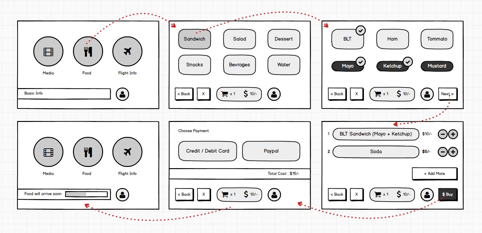
Concept Wireframe
Prototype
Below is a basic demonstrable prototype for the interface concept.
User Testing
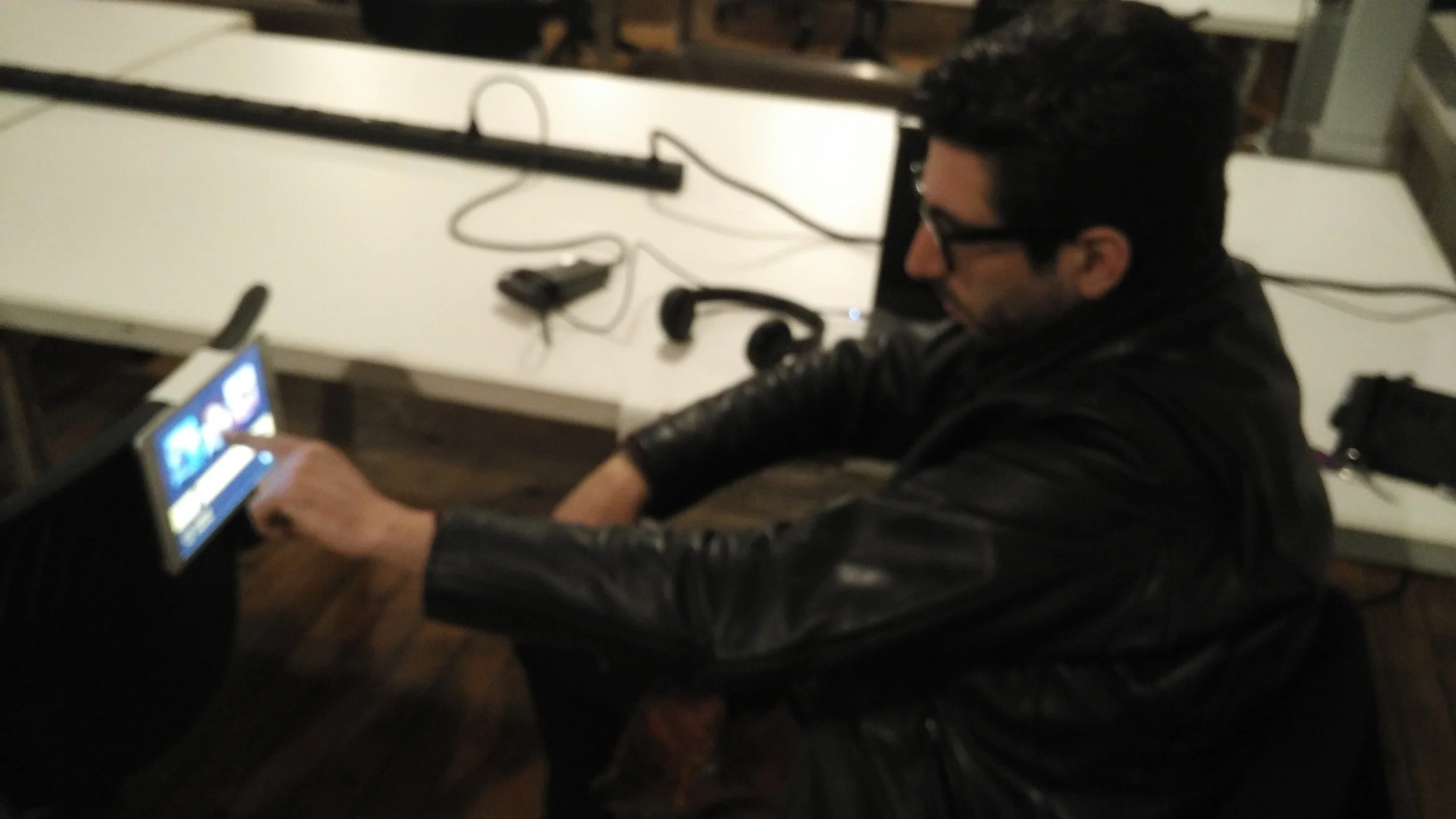
The interactive prototype is opened on an iPad mini, that's attached to back of a chair to simulate inflight experience.
User's task
Order a "BLT Sandwich" and "Tea" using the inflight interface prototype.
Questions for the user
Q1: Was is easy to order? What felt weird or confusing?
Q2: What feedback or information do you feel is important during the experience?
Q3: Was the text and images clear enough to understand?
Q4: Did you face any obstacles or hesitations during payment?
Findings and Suggestions
1: Most users found the experience to be straight-forward and Unobtrusive.
2: The users were able to order and pay for the food without much confusions and deviations from task.
3: The Size and shape of buttons and text seems to work well with all users.
3: The prototype could've had been more detailed so as to let user chose whatever they felt like.
4: There needs to be an option to select quantity of the same order, in the menu.


